
PROJECT
Financielle App
SUMMARY
I headed up the product design of Financielle's brand new App re-launch in 2022
INTRODUCTION
Company background
Financielle started in 2018 when sisters-turned-cofounders Laura and Holly noticed a gap in the financial wellness space particularly for females. Initial interest was sparked by the launch of the MVP, which was a paper spreadsheet and a user guide to follow. For the following couple of years, the sisters spent countless hours researching and speaking with the 1000 users who had bought and paid for the physical product.
With their newfound love for helping females get smarter with their money, Laura and Holly wanted to reach a wider audience and the way they were going to do that was by creating something digital. Then came Financielle App 1.0. Designed and developed by the sisters and an external development team, the App saw good attraction and plenty of downloads, but it wasn't functionally or visually good enough.

DISCOVERY & RESEARCH
Where do we begin?
The first few weeks spent working with Laura and Holly were purely spent conducting a UX review of the existing product, speaking with users and learning about the company goals. We discovered where we wanted the product to be, and what the product's North Star was. We gathered hundreds of conversations, notes of feedback, UX issues, and ideas and we placed each one within an action priority matrix.
This concluded what we wanted to build and what was fundamentally possible. We now knew we needed a financial assistant tool, that could do three things:
-
Help educate impartially but not confined to, Females.
-
Help manage finances
-
Help celebrate money wins, big or small.


DISCOVERY AND RESEARCH
Initial validation
To gain validation on our capturing of research and ideas, we started laying out what each of our main features was going to be within the App. We sketched, wireframed and prototyped simple user flows, gave a link to our OG user group and watched as eyes lit up and faces frowned. We spent quite a lot of time in the cycle of wireframe > feedback > iteration > but this only made decisions easier going forward. We included our development team very early on in the process so that they could be fully aware of what we wanted to achieve and let us know early on if we needed to find compromises.

UX DESIGN
Building out the wireframes
Pretty soon after we had a view of what could be the App, albeit in black, white and grey boxes, but it was taking shape. As we were fleshing out the rest of the App user flows, we were constantly checking back to our main three goals that we wanted to achieve - we wouldn't go ahead with something (even if it was a good idea) if it didn't check those boxes. We took the opportunity to host a couple of demo days for our community members to take a look at the entire App wireframes and collect feedback on how the App worked before we started to think about how it could look. It was at this point, our developers began fleshing out their framework and building out some core parts of the App.


VISUAL DESIGN
Creative direction
A common theme within this project is that nearly 99% of the decisions have been led by some type of user feedback, complaint or idea. That was no different when it came to working on the Financielle brand. We had some key figures join the force to help bring our ideas to life. Firstly, we had a branding agency work with us to produce style boards and an awesome illustrator worked with us to create a suite of illustrations to tie the whole mood together. We shared the process each step of the way with the community and allowed them to voice their opinion and vote for ideas along the way.

VISUAL DESIGN
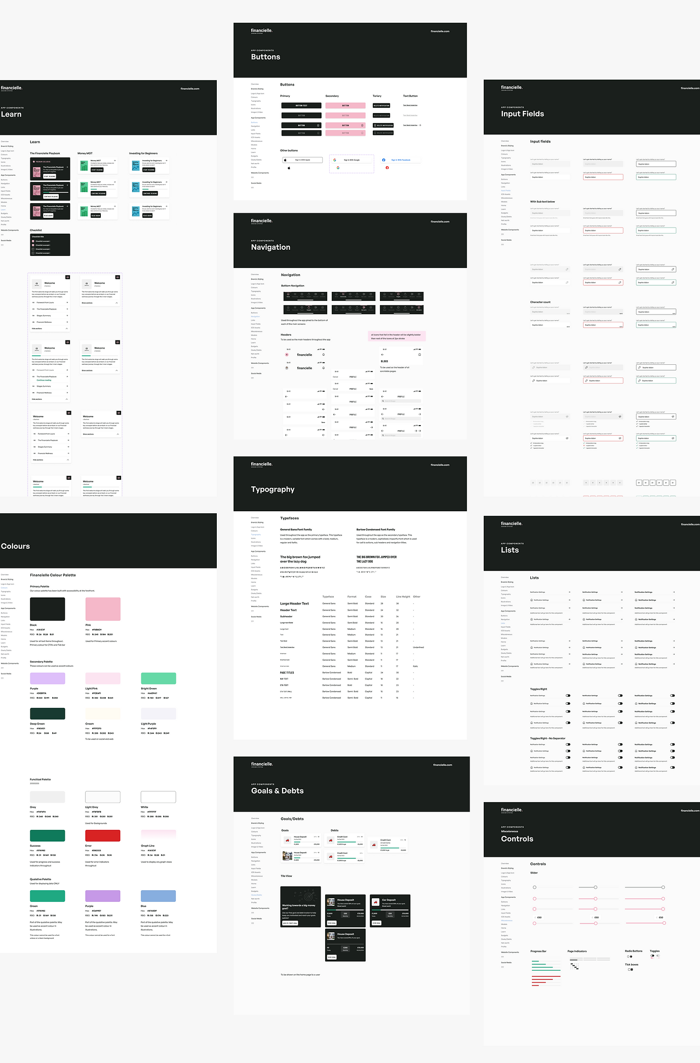
Component library & Styles
Before progressing into the visual design/look and feel of the App, firstly, we broke every single screen of wireframes down into modules. We then worked up a bit of Figma magic and ensured that everything was aligned and spaced out correctly. This was the foundation of our component library that we continue to work on and developed to this day. We created this component library for consistency and efficiency. It has allowed us now to design and develop new features seamlessly with low testing time.
The start of the component library naturally led to the overlay of the visual design. We set up our styles and libraries in Figma so that we had complete consistency with colours and fonts. This also allowed us to change colours across the entire App with a click of a button, making the transition from wireframe > to low-fid design a pleasing process.
VISUAL DESIGN
Interface design
The start of the UI / Visual design process was very exciting as we could start to see the awesome brand that was created for Financielle be brought to life through the App. It wasn't long until we now had two versions of the App - a fully wireframed version and a branded version. We created some teaser promo videos to share with the community showing off all their ideas within our App. We spent some time with the illustrator to create some micro-animations throughout the App to really make it engaging for the user. It was from here we could start to create marketing materials and really felt like we were onto something.
Slide across below to see the differences between the wireframe and the branded version of the App.
HANDOVER
Preparing for launch 🚀
There was not much need for a full developer handover for this project as we were adamant about keeping very open and consistent communication across the whole team. This just meant that once we were completely happy that a section was development-ready, they were fully aware of the entire flow and were able to work section by section. This helped us a lot in the long run as it meant design and development worked parallel for some periods saving us plenty of time. It also meant that we were able to test and QA each section as it was done rather than a big testing effort at the end of the project.
In November 2022, 2 months before launch - we opened up a beta testing group with 20 OG community members. We shared with them a build of the App and allowed them to explore as they pleased. It was a very rewarding moment to see all of our hard work come to life and be used by real-life people. In this period, we noticed that our community still had many many many more ideas and suggestions which for some may have knocked our confidence in what we planned to release, but that wasn't the case. If anything, it made us more excited to get the App out to more people and continue to work on the improvements.

LAUNCH
2.0 Launch 🎉 and what's happened since...
In January 2023, after months of design, development, user research and testing - Financielle 2.0 launched on the App Store and Google Play Store.
As of June 2024, Financielle has had over 200,000 downloads in countries worldwide. We have over 20k active users and have built from scratch a community of like-minded people wanting to become smarter with their money. I continue to work with Laura and Holly frequently. We spend time discussing ideas, improving UX and testing new features with our community.
The most rewarding part of being involved with this App is seeing the happy stories and messages (on the community group within the App) of people's financielle-wins!
Financielle has been featured on the App Store multiple times including App of the Day and a Women in Power feature 🙌


"I have had the pleasure of working with Sophie , an outstanding product designer whose creativity and attention to detail are truly exceptional. Sophie's ability to understand user needs and translate them into intuitive, beautiful designs has consistently impressed our team."
Laura Pomfret, CEO and Founder of Financielle
Credits to Patrick Cauty - creator of all illustrations and animations & Jase Bloor - for the outstanding branding work 👏
